Markup and Bullets Best Practices
Dozuki’s dynamic bullets allow more clarity in the way images and text can interact with each other within a guide step.
Color coding the markups on the image to correlate to the bullets in the text allows authors to tie multiple text instructions to images without causing confusion to the reader.
The best practice would be to establish a company standard for color order that all authors will follow to increase standardization. As a company, Dozuki follows the ROYGBIV order of colors.
Examples
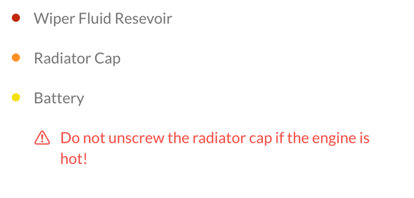
The image below is an example of using colored bullets to attach 3 unique pieces of text to a single image:

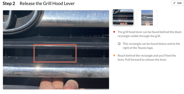
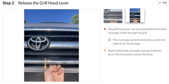
The two images below are an example of using colored bullets to illustrate which line of instruction relates to which image inside a single guide step:


Special Bullets
Colors are not the only option for bullets in a Dozuki guide. There are also three special bullet options:

These are used most effectively with an indent so that they are not mistaken for a step in the process. Here’s an example of an indented ‘note’ below:

The ‘note’ and ‘reminder’ bullets behave the same as colored bullets aside from their look. The ‘Caution’ bullet, however, has a unique behavior. Any text associated with a ‘Caution’ bullet will turn red once the edit is saved as seen in the example below:

How do you use dynamic bullets in your own guides?
Is this a worthwhile discussion?
